Retention Curve: How to Read It and Find Where Your Customers Actually Leave
How to read a SaaS retention curve: flattening vs cliff vs smile shapes, cohort analysis, and the hidden dip failed payments cause.
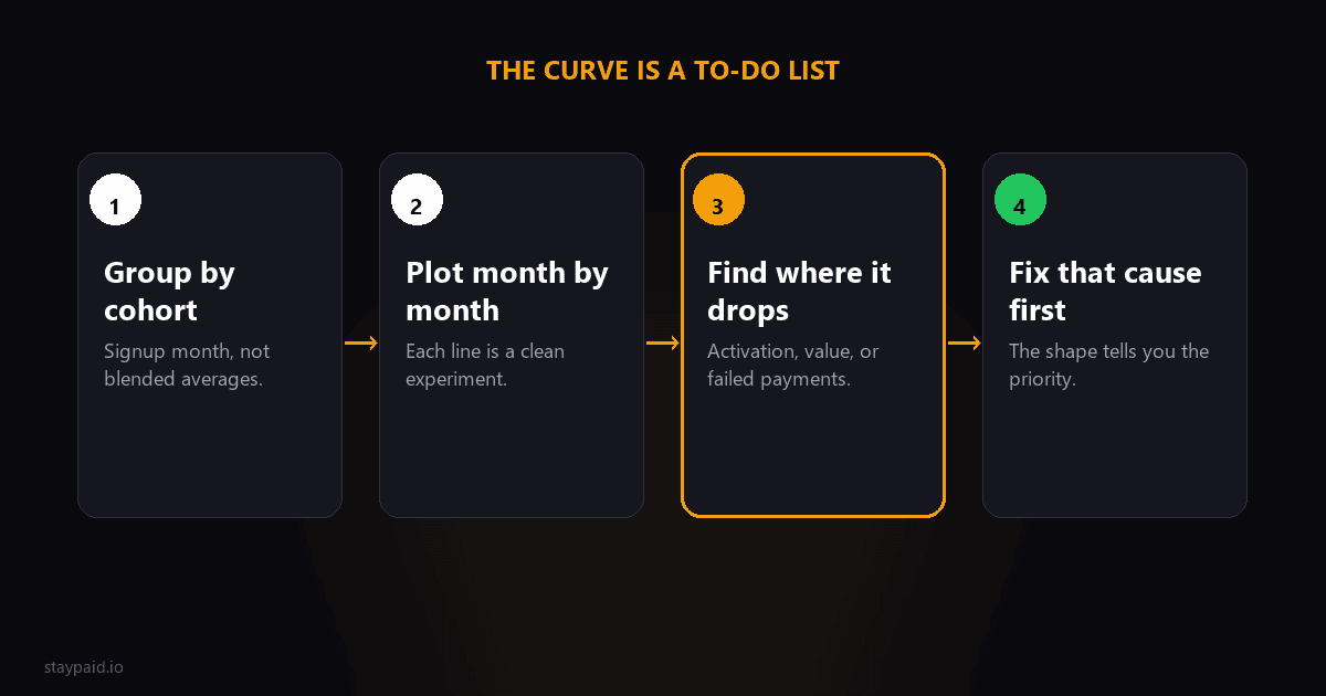
A retention curve plots what percent of a customer cohort is still paying at each point after signup. Read it right and it tells you not just how many customers you lose, but when and why, which is the difference between guessing at churn and fixing it.
Most founders know their monthly churn rate and nothing else. That is like knowing your car's average speed on a road trip but never looking at the map. The curve is the map. Let's learn to read it.
Why cohorts, not averages
Your blended retention number lies to you. If you grew fast last quarter, your customer base is full of new users who have not had time to churn yet, and the blended rate looks great. If growth stalls, the base fills with veterans and the same underlying behavior suddenly looks worse. The metric moves with your growth rate instead of your product quality.
Cohorts fix this. Take everyone who signed up in January. What percent is still paying in February, March, June? Plot it. Do the same for February, March. Now every line is a clean experiment: same starting conditions, watched over time. When a line changes shape, something real changed.
The three shapes and what they mean
- •Flattening curve: drops early, then levels off horizontal. You lose some new users fast (they were never a fit) but the rest stick indefinitely. This is the signature of a durable business. Nearly every good SaaS curve looks like this.
- •Cliff curve: keeps declining toward zero with no flattening. Everyone leaves eventually; it is only a matter of when. No amount of acquisition fixes this, because you are pouring water into a bucket with no bottom. The product has to change before the marketing budget grows.
- •Smile curve: dips, then rises. Former customers come back, or remaining customers expand enough to push net retention above 100%. Rare and beautiful. It means leaving you is painful, and reactivating the departed is easier than acquiring strangers.
The first thing to check on your own curve is brutally simple: does the tail go flat? If yes, your job is reducing the early drop. If no, your job is existential, and no dunning tool or onboarding flow will save you.
Finding WHERE your curve breaks
The drops on your curve each have a cause, and different causes need completely different fixes. The usual suspects:
- •A steep drop in week 1 is an activation problem. People signed up, never got value, left. Fix: onboarding, time-to-value, maybe who you are acquiring.
- •A drop at the first renewal (month 1 to 2) is a value-perception problem. They tried it, shrugged, and the second charge made the decision for them. Fix: the habit loop, or your pricing cadence.
- •A sawtooth pattern at each billing date, where a slice disappears every single month like clockwork, is very often involuntary churn: failed payments quietly converting to cancellations. This one hides in plain sight because it looks identical to voluntary churn in most dashboards.
The involuntary dip nobody looks for
Here is the part most retention-curve guides skip. Around 20 to 40% of subscription churn is involuntary: the customer's card declined, the retries were mishandled, and the account lapsed. On your curve, this appears as steady losses at each billing event, distributed evenly across cohorts, with no correlation to how engaged the customer was. Your best, happiest customers churn through it at the same rate as your bored ones.
The diagnostic: split your curve by churn reason. Take one cohort, separate the customers who cancelled (chose to leave) from those whose subscriptions lapsed after failed payments (never chose anything). Most founders who do this for the first time have the same reaction: a meaningful slice of the curve they thought was a product problem is actually a payments problem. That is the cheapest segment of the curve to fix, because the customer already wants to stay. You just have to recover the payment properly instead of letting one declined card kill the relationship.
Using the curve to prioritize
Once you can read the shapes, prioritization gets easy. A broken activation drop means fix onboarding before anything else. A flat tail with a big involuntary sawtooth means payment recovery is your highest-ROI project this quarter, full stop. A smile forming means build a reactivation program. The curve is not a report, it is a to-do list ordered by dollars.
Building it in an afternoon with the data you already have
You do not need a BI tool for this. Export your subscriptions from Stripe, and in a spreadsheet: one column for signup month (the cohort), one for the month each subscription ended (blank if still active). Then a pivot table gives you, for each cohort, how many were still alive at each subsequent month. Divide each by the cohort's starting size and you have the curve. An hour of spreadsheet work for a diagnostic most $100k MRR companies have never run.
One practical tip: run the same pivot twice, once on all churn and once on voluntary-only churn (exclude subscriptions that ended after failed payments without a cancellation). The gap between the two curves is your involuntary churn, made visible as its own shape for the first time. For most subscription products that gap is bigger than anyone expected.
Choosing your cohort window
Weekly or monthly cohorts? Match the window to your billing and volume. A monthly-billed SaaS with hundreds of signups a month should use monthly cohorts; weekly adds noise without adding insight. If you bill annually, quarterly cohorts are the honest unit. And if your signup volume is small, widen the window until each cohort has enough members that one cancellation does not swing the line by five points. A curve built from 12-person cohorts tells you about luck, not retention.
The curve is also how you evaluate changes honestly. Raise prices in June? Compare the July cohort's early curve against the spring cohorts. Ship the new onboarding in September? The October cohort's first-month drop tells you within weeks whether it worked. Without cohorts, every change's effect dissolves into the blended average and you are back to guessing.
And do not wait for perfect data. A rough curve built from an imperfect export beats the blended churn number you are using today. You can refine the cohort definitions later; the shape of the problem, where the drops are and whether the tail flattens, shows up in the rough version already. Most founders who finally build it say the same thing: I should have done this a year ago.
Keep the curve visible once you have it. Pin it in the team channel, update it monthly, and let it argue with your roadmap. It has a way of winning arguments that opinions lose: when the tail flattens after a change, nobody asks whether the change worked. When it does not, nobody gets to pretend it did.
And when you find that involuntary sawtooth, that is exactly the problem I built StayPaid for. It catches failed renewals the moment they happen, retries them at sane intervals, and emails the customer from your real address like a human who noticed, so the customers who never wanted to leave simply do not leave. Your curve gets flatter without you touching the product.
FAQ
What is a retention curve?
A retention curve plots what percentage of a customer cohort is still active at each point in time after signup: week 1, month 1, month 6, and so on. It turns churn from a single monthly number into a shape you can diagnose, because where the curve drops tells you why customers leave.
What does a good retention curve look like?
It flattens. Nearly every product loses a chunk of new users early; the question is whether the curve levels off into a horizontal line (you have a stable core of long-term customers) or keeps sliding toward zero (everyone eventually leaves). A flat tail, even after a steep early drop, is a healthy business.
What is a smile retention curve?
A curve that dips and then rises back up, because resurrected or expanding customers return or grow usage. It usually means your product has strong network or data lock-in effects: people leave, feel the loss, and come back. It is rare, and when you have one, reactivation is your highest-ROI growth channel.
How do I build a retention curve for my SaaS?
Group customers by signup month (cohorts), then for each cohort calculate what percent is still paying at month 1, 2, 3 and so on. Plot each cohort as a line. Your analytics tool may do this automatically; a spreadsheet with Stripe exports works too. The key is cohorts, not blended averages.
Keep reading
Robert
Founder at StayPaid
Want to recover failed payments like a founder?
Start Free — First 3 recoveries